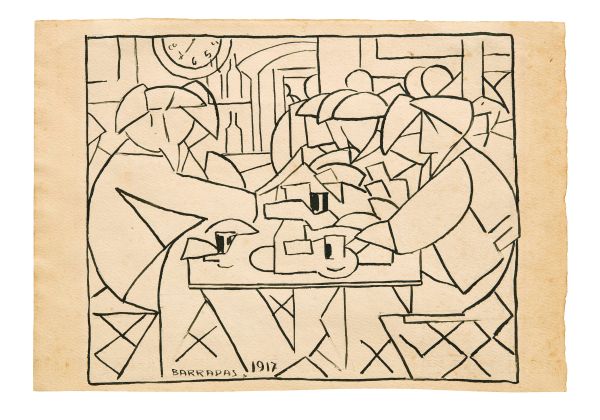
55
Rafael Barradas
(Montevideo, 1890 - 1929)
Rafael Barradas
Rafael Barradas
(Montevideo 1890 - 1929)
MENSA OPERAIA
1917
firmato e [..]
55
Free Bid
Rafael Barradas
(Montevideo, 1890 - 1929)
Rafael Barradas
Rafael Barradas
(Montevideo 1890 - 1929)
MENSA OPERAIA
1917
firmato e [..]
Estimate
€ 1.000 / 1.500
Sold
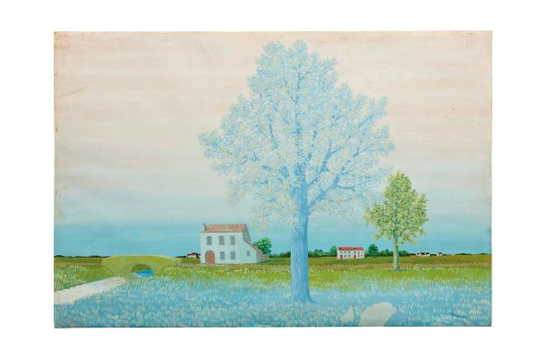
54
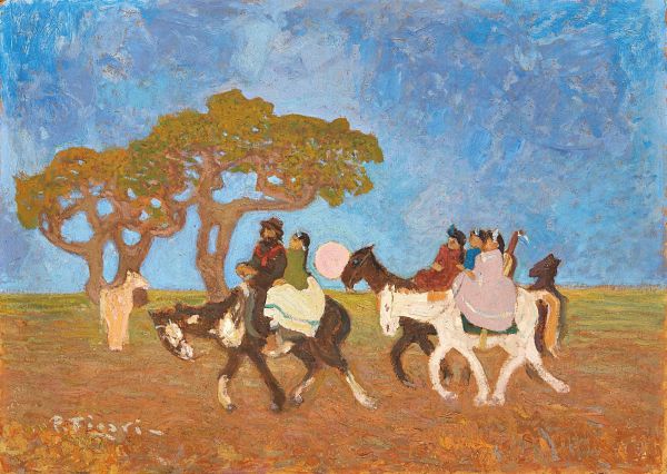
Pedro Figari
(Montevideo, 1861 - 1938)
Pedro Figari
Pedro Figari
(Montevideo 1861 - 1938)
A LA FIESTA
1933 circa
firmato in [..]
54
Free Bid
Pedro Figari
(Montevideo, 1861 - 1938)
Pedro Figari
Pedro Figari
(Montevideo 1861 - 1938)
A LA FIESTA
1933 circa
firmato in [..]
Estimate
€ 4.000 / 6.000
Sold
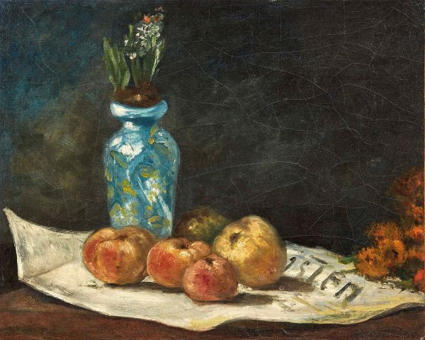
53
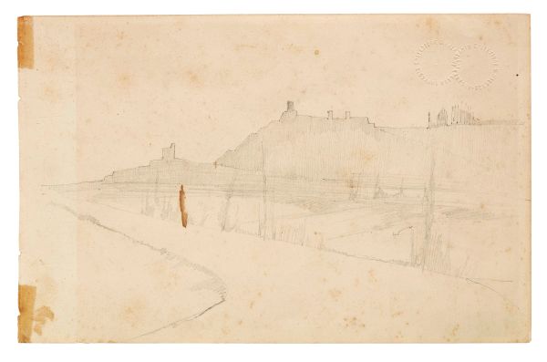
Giovanni Fattori
(Livorno, 1825 - Firenze, 1908)
Giovanni Fattori
Giovanni Fattori
(Livorno 1825 - Firenze 1908)
PAESAGGIO ( recto )
ALBERO [..]
53
Free Bid
Giovanni Fattori
(Livorno, 1825 - Firenze, 1908)
Giovanni Fattori
Giovanni Fattori
(Livorno 1825 - Firenze 1908)
PAESAGGIO ( recto )
ALBERO [..]
Estimate
€ 800 / 1.200
Sold
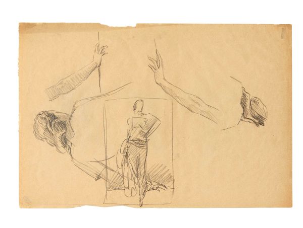
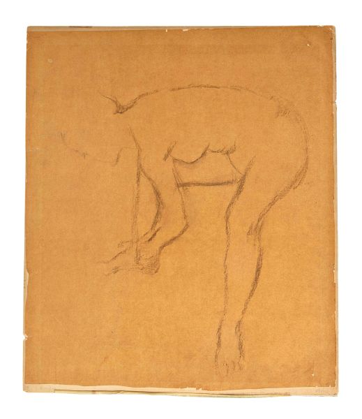
Marcello Dudovich©
(Trieste, 1878 - Milano, 1962)
Marcello Dudovich
Marcello Dudovich
(Trieste 1878 - Milano 1962)
STUDI DI FIGURE FEMMINILI ( recto [..]
52
Free Bid
Marcello Dudovich©
(Trieste, 1878 - Milano, 1962)
Marcello Dudovich
Marcello Dudovich
(Trieste 1878 - Milano 1962)
STUDI DI FIGURE FEMMINILI ( recto [..]
Estimate
€ 800 / 1.200
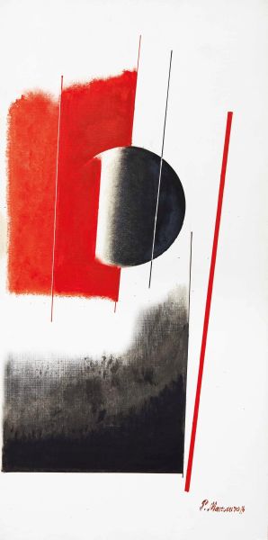
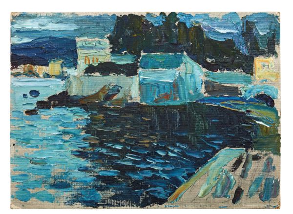
Pavel Mansouroff©
(Sankt-petersburg, 1896 - Nice, 1983)
Pavel Mansouroff
Pavel Mansouroff
(Sankt-Petersburg 1896 - Nice 1983)
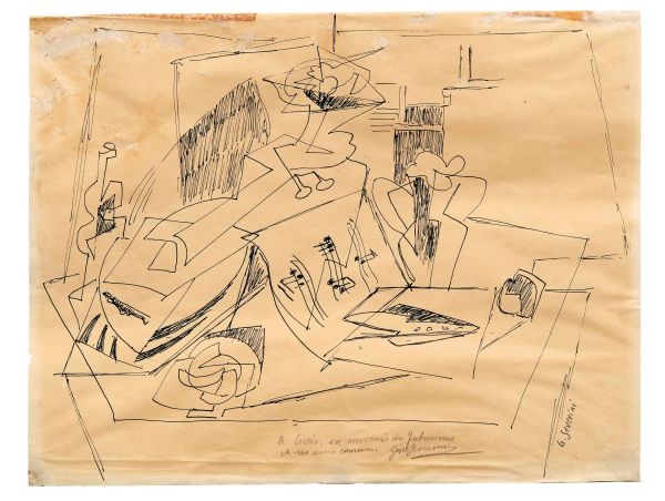
COMPOSIZIONE ASTRATTA
[..]
51
Free Bid
Pavel Mansouroff©
(Sankt-petersburg, 1896 - Nice, 1983)
Pavel Mansouroff
Pavel Mansouroff
(Sankt-Petersburg 1896 - Nice 1983)
COMPOSIZIONE ASTRATTA
[..]
Estimate
€ 2.000 / 3.000
Sold
Francesco Messina©
(Linguaglossa, 1900 - Milano, 1995)
Francesco Messina
Francesco Messina
(Linguaglossa 1900 - Milano 1995)
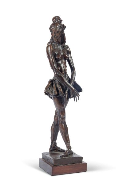
DANZATRICE
1969
firmato [..]
50
Free Bid
Francesco Messina©
(Linguaglossa, 1900 - Milano, 1995)
Francesco Messina
Francesco Messina
(Linguaglossa 1900 - Milano 1995)
DANZATRICE
1969
firmato [..]
Estimate
€ 1.000 / 2.000
Sold
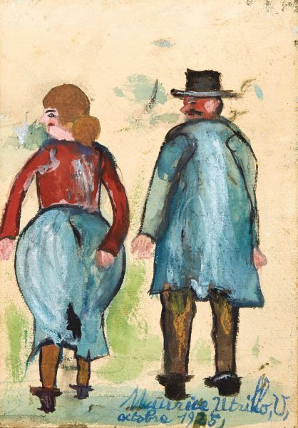
Maurice Utrillo©
(Paris, 1883 - Dax, 1955)
Maurice Utrillo
Maurice Utrillo
(Paris 1883 - Dax 1955)
LE COUPLE
1925
firmato e datato [..]
49
Free Bid
Maurice Utrillo©
(Paris, 1883 - Dax, 1955)
Maurice Utrillo
Maurice Utrillo
(Paris 1883 - Dax 1955)
LE COUPLE
1925
firmato e datato [..]
Estimate
€ 5.000 / 7.000
Sold
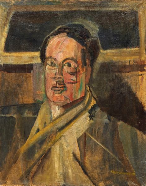
Bruno Cassinari©
(Piacenza, 1912 - Milano, 1992)
Bruno Cassinari
Bruno Cassinari
(Piacenza 1912 - Milano 1992)
RITRATTO DI SALVATORE QUASIMODO
[..]
48
Free Bid
Bruno Cassinari©
(Piacenza, 1912 - Milano, 1992)
Bruno Cassinari
Bruno Cassinari
(Piacenza 1912 - Milano 1992)
RITRATTO DI SALVATORE QUASIMODO
[..]
Estimate
€ 4.000 / 6.000
Sold
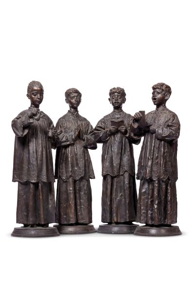
Francesco Messina©
(Linguaglossa, 1900 - Milano, 1995)
Francesco Messina
Francesco Messina
(Linguaglossa 1900 - Milano 1995)
QUATTRO CHIERICHETTI
1950 [..]
47
Free Bid
Francesco Messina©
(Linguaglossa, 1900 - Milano, 1995)
Francesco Messina
Francesco Messina
(Linguaglossa 1900 - Milano 1995)
QUATTRO CHIERICHETTI
1950 [..]
Estimate
€ 4.000 / 6.000
Sold
Bruno Cassinari©
(Piacenza, 1912 - Milano, 1992)
Bruno Cassinari
Bruno Cassinari
(Piacenza 1912 - Milano 1992)
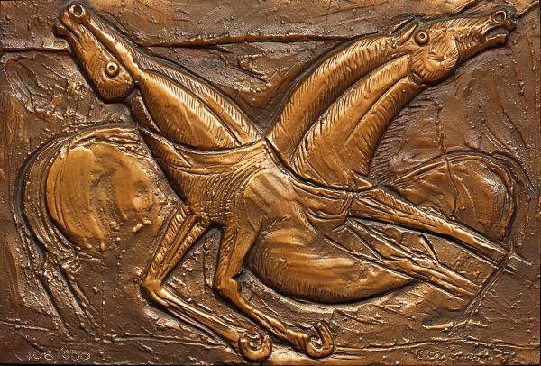
CAVALLI
firmato in basso a destra [..]
46
Free Bid
Bruno Cassinari©
(Piacenza, 1912 - Milano, 1992)
Bruno Cassinari
Bruno Cassinari
(Piacenza 1912 - Milano 1992)
CAVALLI
firmato in basso a destra [..]
Estimate
€ 1.000 / 2.000
Sold
45
Guglielmo Ciardi
(Venezia, 1842 - 1917)
Guglielmo Ciardi
Guglielmo Ciardi
(Venezia 1842 - 1917)
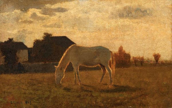
CAVALLO BIANCO
1869
firmato e datato [..]
45
Free Bid
Guglielmo Ciardi
(Venezia, 1842 - 1917)
Guglielmo Ciardi
Guglielmo Ciardi
(Venezia 1842 - 1917)
CAVALLO BIANCO
1869
firmato e datato [..]
Estimate
€ 5.000 / 7.000
Sold
Gino Severini©
(Cortona, 1883 - Paris, 1966)
Gino Severini
Gino Severini
(Cortona 1883 - Paris 1966)
NATURA MORTA
firmato in basso a destra [..]
44
Free Bid
Gino Severini©
(Cortona, 1883 - Paris, 1966)
Gino Severini
Gino Severini
(Cortona 1883 - Paris 1966)
NATURA MORTA
firmato in basso a destra [..]
Estimate
€ 4.000 / 6.000
Sold
Gino Severini©
(Cortona, 1883 - Paris, 1966)
Gino Severini
Gino Severini
(Cortona 1883 - Paris 1966)
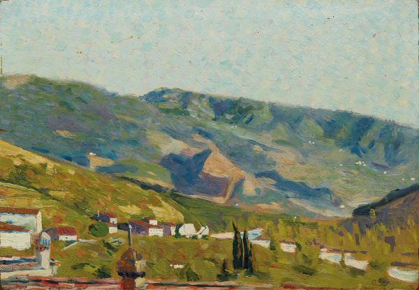
VALLATA TOSCANA
1903 circa
firmato [..]
43
Free Bid
Gino Severini©
(Cortona, 1883 - Paris, 1966)
Gino Severini
Gino Severini
(Cortona 1883 - Paris 1966)
VALLATA TOSCANA
1903 circa
firmato [..]
Estimate
€ 12.000 / 18.000
Sold
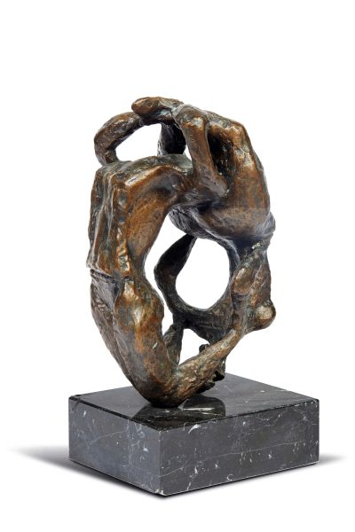
Luciano Minguzzi©
(Bologna, 1911 - Milano, 2004)
Luciano Minguzzi
Luciano Minguzzi
(Bologna 1911 - Milano 2004)
ACROBATI CONTORSIONISTI
firmato [..]
42
Free Bid
Luciano Minguzzi©
(Bologna, 1911 - Milano, 2004)
Luciano Minguzzi
Luciano Minguzzi
(Bologna 1911 - Milano 2004)
ACROBATI CONTORSIONISTI
firmato [..]
Estimate
€ 3.000 / 5.000
Sold
40
Raffaello Sorbi
(Firenze, 1844 - 1931)
Raffaello Sorbi
Raffaello Sorbi
(Firenze 1844 - 1931)
CIMABUE
1919 circa
firmato in basso [..]
40
Free Bid
Raffaello Sorbi
(Firenze, 1844 - 1931)
Raffaello Sorbi
Raffaello Sorbi
(Firenze 1844 - 1931)
CIMABUE
1919 circa
firmato in basso [..]
Estimate
€ 1.500 / 2.500
Sold
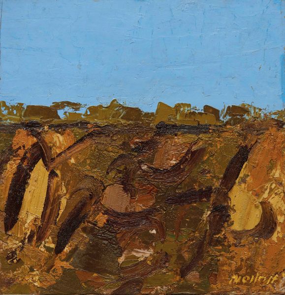
Ennio Morlotti©
(Lecco, 1910 - Milano, 1992)
Ennio Morlotti
Ennio Morlotti
(Lecco 1910 - Milano 1992)
ROCCE
1979
firmato in basso [..]
39
Free Bid
Ennio Morlotti©
(Lecco, 1910 - Milano, 1992)
Ennio Morlotti
Ennio Morlotti
(Lecco 1910 - Milano 1992)
ROCCE
1979
firmato in basso [..]
Estimate
€ 8.000 / 12.000
Sold
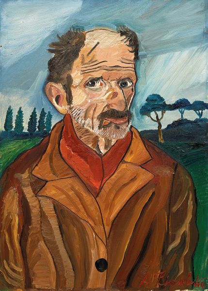
Antonio Ligabue©
(Zürich, 1899 - Gualtieri, 1965)
Antonio Ligabue
Antonio Ligabue
(Zürich 1899 - Gualtieri 1965)
AUTORITRATTO
1960-1961 [..]
38
Free Bid
Antonio Ligabue©
(Zürich, 1899 - Gualtieri, 1965)
Antonio Ligabue
Antonio Ligabue
(Zürich 1899 - Gualtieri 1965)
AUTORITRATTO
1960-1961 [..]
Estimate
€ 12.000 / 18.000
Sold
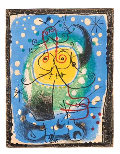
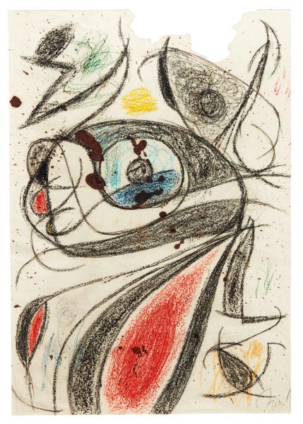
Joan Miro' I Ferrà©
(Barcelona, 1893 - Palma de mallorca, 1983)
Joan Miró i Ferrà
Joan Miró i Ferrà
(Barcelona 1893 - Palma de Mallorca 1983)
PERSONNAGE [..]
37
Free Bid
Joan Miro' I Ferrà©
(Barcelona, 1893 - Palma de mallorca, 1983)
Joan Miró i Ferrà
Joan Miró i Ferrà
(Barcelona 1893 - Palma de Mallorca 1983)
PERSONNAGE [..]
Estimate
€ 4.000 / 6.000
Sold
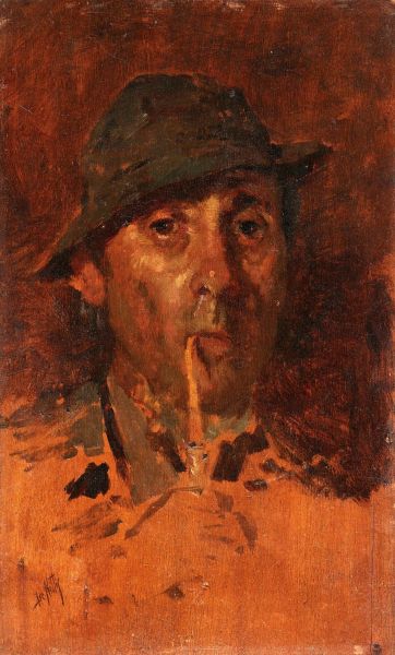
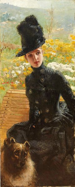
36
Giuseppe De Nittis
(Barletta, 1846 - Saint-germain-en-laye, 1884)
Giuseppe De Nittis
Giuseppe De Nittis
(Barletta 1846 - Saint-Germain-en-Laye 1884)
UOMO CON CAPPELLO [..]
36
Free Bid
Giuseppe De Nittis
(Barletta, 1846 - Saint-germain-en-laye, 1884)
Giuseppe De Nittis
Giuseppe De Nittis
(Barletta 1846 - Saint-Germain-en-Laye 1884)
UOMO CON CAPPELLO [..]
Estimate
€ 12.000 / 18.000
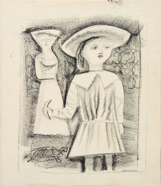
Massimo Campigli©
(Berlin, 1895 - Saint-tropez, 1971)
Massimo Campigli
Massimo Campigli
(Berlin 1895 - Saint-Tropez 1971)
BAMBINA E TARTARUGA
1952 [..]
35
Free Bid
Massimo Campigli©
(Berlin, 1895 - Saint-tropez, 1971)
Massimo Campigli
Massimo Campigli
(Berlin 1895 - Saint-Tropez 1971)
BAMBINA E TARTARUGA
1952 [..]
Estimate
€ 2.000 / 3.000
Sold
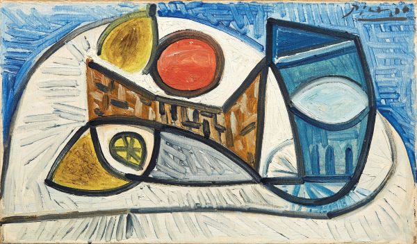
Pablo Picasso©
(Malaga, 1881 - Mougins, 1973)
Pablo Picasso
Pablo Picasso
(Malaga 1881 - Mougins 1973)
NATURE MORTE AU CITRON, À L’ORANGE [..]
34
Free Bid
Pablo Picasso©
(Malaga, 1881 - Mougins, 1973)
Pablo Picasso
Pablo Picasso
(Malaga 1881 - Mougins 1973)
NATURE MORTE AU CITRON, À L’ORANGE [..]
Estimate
€ 800.000 / 1.200.000
Sold
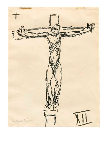
Henri Matisse©
(Le cateau-cambrésis, 1869 - Nice, 1954)
Henri Matisse
Henri Matisse
(Le Cateau-Cambrésis 1869 - Nice 1954)
LE CHRIST EN CROIX, [..]
33
Free Bid
Henri Matisse©
(Le cateau-cambrésis, 1869 - Nice, 1954)
Henri Matisse
Henri Matisse
(Le Cateau-Cambrésis 1869 - Nice 1954)
LE CHRIST EN CROIX, [..]
Estimate
€ 10.000 / 15.000
Sold
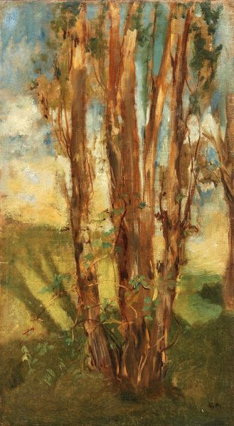
32
Édouard Manet
(Paris, 1832 - 1883)
Édouard Manet
Édouard Manet
(Paris 1832 - 1883)
ÉTUDE D’ARBRES
1859 circa [..]
32
Free Bid
Édouard Manet
(Paris, 1832 - 1883)
Édouard Manet
Édouard Manet
(Paris 1832 - 1883)
ÉTUDE D’ARBRES
1859 circa [..]
Estimate
€ 180.000 / 250.000
Sold
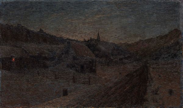
31
Giovanni Segantini
(Arco, 1858 - Monte schafberg, engadina, 1899)
Giovanni Segantini
Giovanni Segantini
(Arco 1858 - Monte Schafberg, Engadina 1899)
SAVOGNINO D’INVERNO [..]
31
Free Bid
Giovanni Segantini
(Arco, 1858 - Monte schafberg, engadina, 1899)
Giovanni Segantini
Giovanni Segantini
(Arco 1858 - Monte Schafberg, Engadina 1899)
SAVOGNINO D’INVERNO [..]
Estimate
€ 100.000 / 180.000
Sold
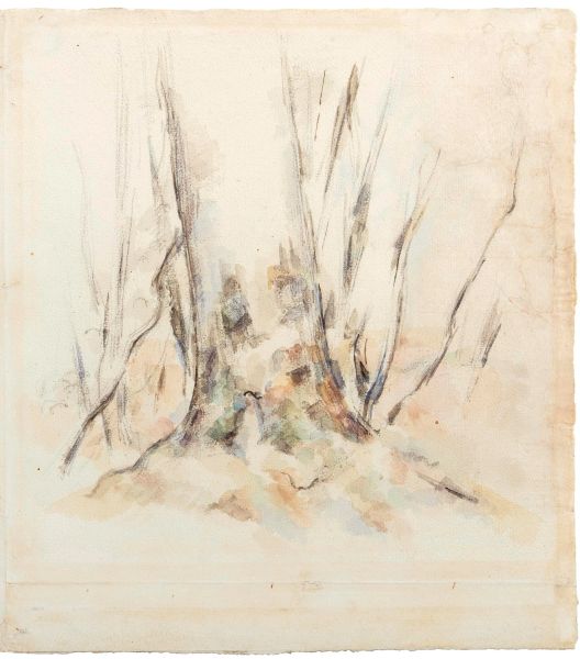
30
Paul Cézanne
(Aix-en-provence, 1839 - 1906)
Paul Cézanne
Paul Cézanne
(Aix-en-Provence 1839 - 1906)
LE HÊTRE
1883-1885 [..]
30
Free Bid
Paul Cézanne
(Aix-en-provence, 1839 - 1906)
Paul Cézanne
Paul Cézanne
(Aix-en-Provence 1839 - 1906)
LE HÊTRE
1883-1885 [..]
Estimate
€ 80.000 / 120.000
Sold
29
Umberto Boccioni
(Reggio calabria, 1882 - Verona, 1916)
Umberto Boccioni
Umberto Boccioni
(Reggio Calabria 1882 - Verona 1916)
IL FALCIATORE
oppure [..]
29
Free Bid
Umberto Boccioni
(Reggio calabria, 1882 - Verona, 1916)
Umberto Boccioni
Umberto Boccioni
(Reggio Calabria 1882 - Verona 1916)
IL FALCIATORE
oppure [..]
Estimate
€ 150.000 / 250.000
Sold
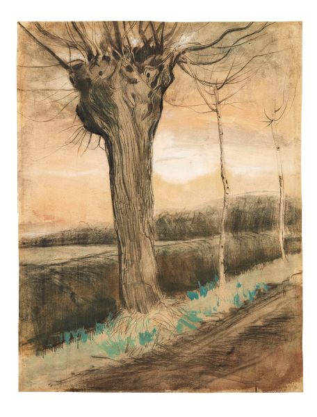
28
Vincent Van Gogh
(Zundert, 1853 - Auvers-sur-oise, 1890)
Vincent van Gogh
Vincent van Gogh
(Zundert 1853 - Auvers-sur-Oise 1890)
POLLARD WILLOW
ottobre [..]
28
Free Bid
Vincent Van Gogh
(Zundert, 1853 - Auvers-sur-oise, 1890)
Vincent van Gogh
Vincent van Gogh
(Zundert 1853 - Auvers-sur-Oise 1890)
POLLARD WILLOW
ottobre [..]
Estimate
€ 200.000 / 300.000
Sold
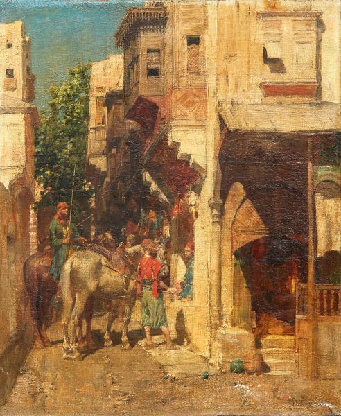
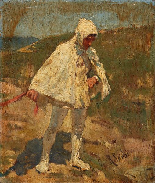
27
Alberto Pasini
(Busseto, 1826 - Cavoretto, 1899)
Alberto Pasini
Alberto Pasini
(Busseto 1826 - Cavoretto 1899)
SOUVENIR D’ORIENT
firmato [..]
27
Free Bid
Alberto Pasini
(Busseto, 1826 - Cavoretto, 1899)
Alberto Pasini
Alberto Pasini
(Busseto 1826 - Cavoretto 1899)
SOUVENIR D’ORIENT
firmato [..]
Estimate
€ 30.000 / 50.000
Sold
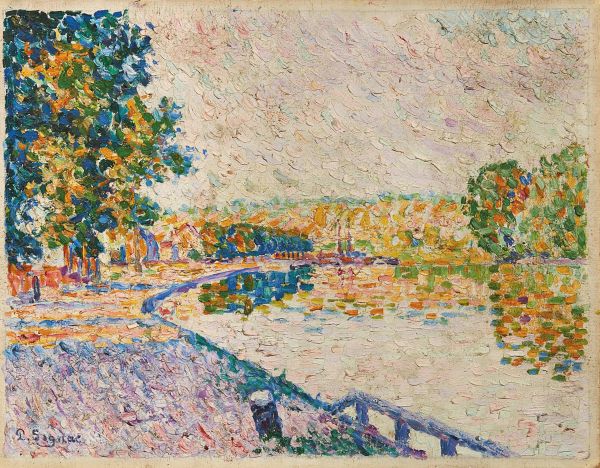
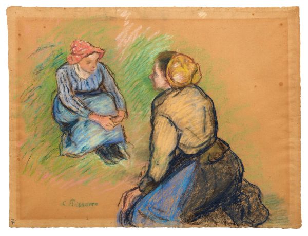
26
Paul Signac
(Paris, 1863 - 1935)
Paul Signac
Paul Signac
(Paris 1863 - 1935)
SAMOIS. ÉTUDE N. 11
1899
firmato [..]
26
Free Bid
Paul Signac
(Paris, 1863 - 1935)
Paul Signac
Paul Signac
(Paris 1863 - 1935)
SAMOIS. ÉTUDE N. 11
1899
firmato [..]
Estimate
€ 120.000 / 180.000
Sold