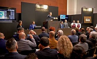
Milan, tue 29 October 2019
Rediscovered Treasures Impressionists and Modern Masterpieces from a Private Collection
Live auction, n.315
MILAN
7.00 p.m.
FURTHER INFORMATION AND ABSENTEE AND PHONE BIDS
To gain access to the saleroom you will need to ask for a ticket. Please contact our offices at:
Milan +39 02 76320327
Milan +39 02 76320328
bids@pandolfini.it
7.00 p.m.
FURTHER INFORMATION AND ABSENTEE AND PHONE BIDS
To gain access to the saleroom you will need to ask for a ticket. Please contact our offices at:
Milan +39 02 76320327
Milan +39 02 76320328
bids@pandolfini.it
Viewing
MILAN25 October 2019, 10 am - 6 pm
26 October 2019, 10 am - 6 pm
27 October 2019, 10 am - 6 pm
28 October 2019, 10 am - 6 pm
Centro Svizzero
Via Palestro 2

Auction Highlights
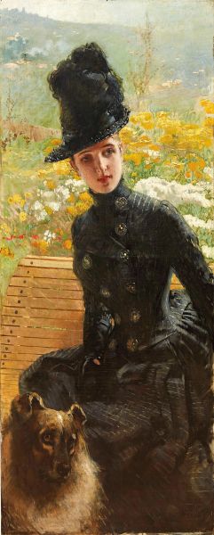
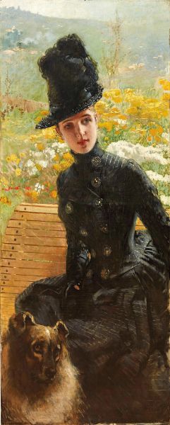
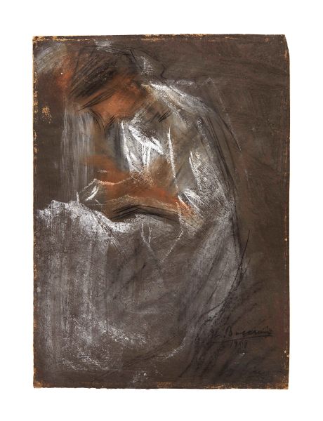
Lot N. 12
Vittorio Matteo Corcos
(Livorno, 1859 - Firenze, 1933)
Vittorio Matteo Corcos
Vittorio Matteo Corcos
(Livorno 1859 - Firenze 1933)
DONNA CON CANE
1885
recante firma apocrifa “De Nittis” in [..]
Estimate
€ 80.000 / 120.000

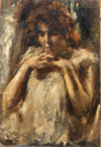
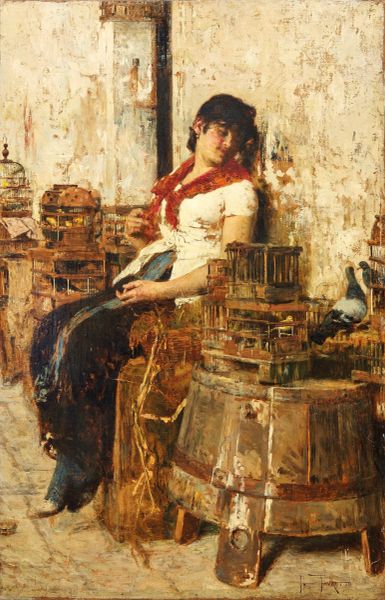
Lot N. 18
Giacomo Favretto
(Venezia, 1849 - 1887)
Giacomo Favretto
Giacomo Favretto
(Venezia 1849 - 1887)
VENDITRICE DI UCCELLI
1881 circa
firmato in basso a destra
olio su tela
[..]
Estimate
€ 80.000 / 120.000
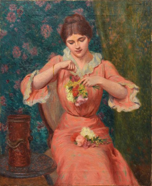
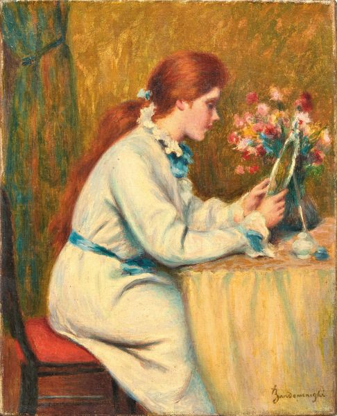
Lot N. 5
Federico Zandomeneghi
(Venezia, 1841 - Paris, 1917)
Federico Zandomeneghi
Federico Zandomeneghi
(Venezia 1841 - Paris 1917)
FEMME AU BOUQUET
1914
firmato e datato “914” in alto a destra [..]
Estimate
€ 120.000 / 180.000
Lot N. 7
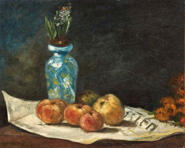
Paul Gauguin
(Paris, 1848 - Hiva oa, 1903)
Paul Gauguin
Paul Gauguin
(Paris 1848 - Hiva Oa 1903)
JACINTHES ET POMMES SUR UN JOURNAL
1876 circa
firmato in basso a sinistra
[..]
Estimate
€ 150.000 / 250.000
Lot N. 21
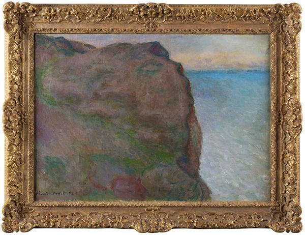
Claude Monet
(Paris, 1840 - Giverny, 1926)
Claude Monet
Claude Monet
(Paris 1840 - Giverny 1926)
FALAISE DU PETIT AILLY À VARENGEVILLE
1896-1897
firmato e datato successivamente [..]
Estimate
€ 800.000 / 1.200.000

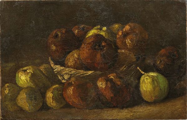
Lot N. 17
Vincent Van Gogh
(Zundert, 1853 - Auvers-sur-oise, 1890)
Vincent van Gogh
Vincent van Gogh
(Zundert 1853 - Auvers-sur-Oise 1890)
STILL LIFE WITH A BASKET OF APPLES
1885 circa
olio su tela
cm [..]
Estimate
€ 280.000 / 350.000

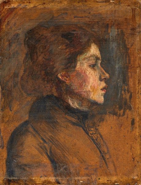
Lot N. 19
Henri De Toulouse-Lautrec
(Albi, 1864 - Saint-andré-du-bois, 1901)
Henri de Toulouse-Lautrec
Henri de Toulouse-Lautrec
(Albi 1864 - Saint-André-du-Bois 1901)
TÊTE DE FEMME
1899 circa
olio su cartone [..]
Estimate
€ 80.000 / 120.000

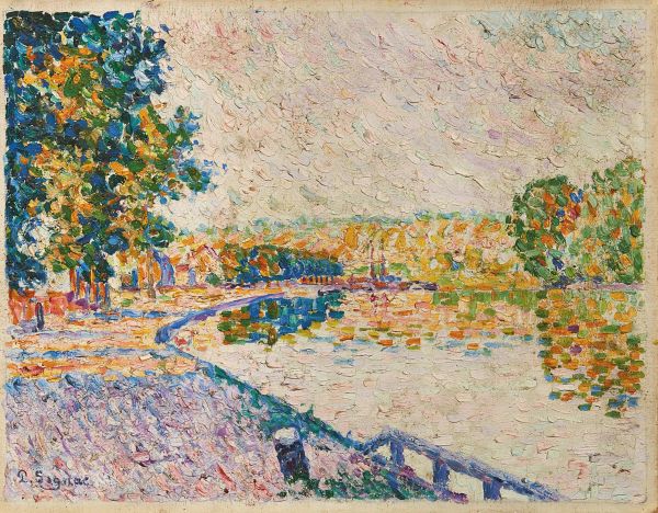
Lot N. 26
Paul Signac
(Paris, 1863 - 1935)
Paul Signac
Paul Signac
(Paris 1863 - 1935)
SAMOIS. ÉTUDE N. 11
1899
firmato in basso a sinistra
olio su cartoncino telato [..]
Estimate
€ 120.000 / 180.000
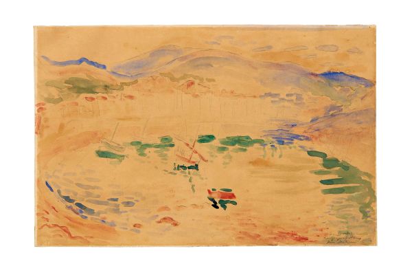
Lot N. 27
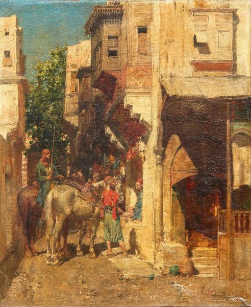
Alberto Pasini
(Busseto, 1826 - Cavoretto, 1899)
Alberto Pasini
Alberto Pasini
(Busseto 1826 - Cavoretto 1899)
SOUVENIR D’ORIENT
firmato in basso a destra
olio su tela
cm 27,5x22,4 [..]
Estimate
€ 30.000 / 50.000

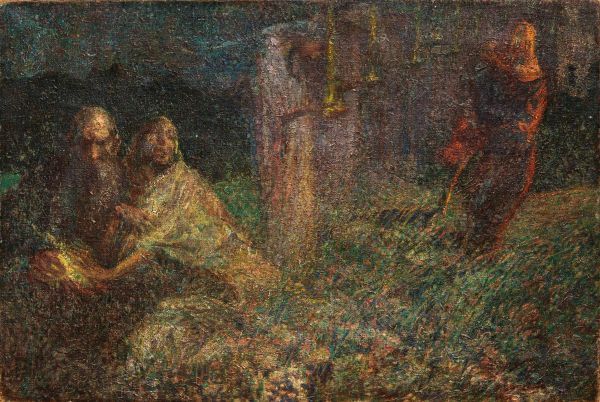
Lot N. 14
Gaetano Previati
(Ferrara, 1852 - Lavagna, 1920)
Gaetano Previati
Gaetano Previati
(Ferrara 1852 - Lavagna 1920)
PENSIERI
1885 circa
firmato in basso a sinistra
olio su tela
cm [..]
Estimate
€ 15.000 / 25.000

Lot N. 25
Federico Zandomeneghi
(Venezia, 1841 - Paris, 1917)
Federico Zandomeneghi
Federico Zandomeneghi
(Venezia 1841 - Paris 1917)
LA TOILETTE
1897 circa
firmato in basso a destra
olio su tela [..]
Estimate
€ 30.000 / 50.000
Lot N. 31
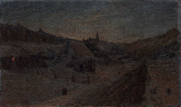
Giovanni Segantini
(Arco, 1858 - Monte schafberg, engadina, 1899)
Giovanni Segantini
Giovanni Segantini
(Arco 1858 - Monte Schafberg, Engadina 1899)
SAVOGNINO D’INVERNO
1888 circa
firmato in basso a [..]
Estimate
€ 100.000 / 180.000
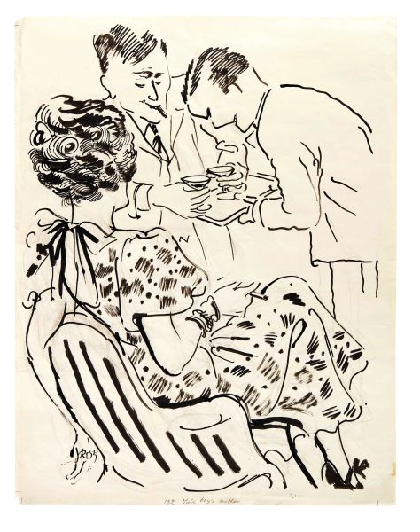
George Grosz©
(Berlino, 1893 - 1959)
George Grosz
George Grosz
(Berlin 1893 - 1959)
YALE BOY’S MOTHER
1937-1938
firmato [..]
1
Free Bid
George Grosz©
(Berlino, 1893 - 1959)
George Grosz
George Grosz
(Berlin 1893 - 1959)
YALE BOY’S MOTHER
1937-1938
firmato [..]
Estimate
€ 5.000 / 7.000
Sold
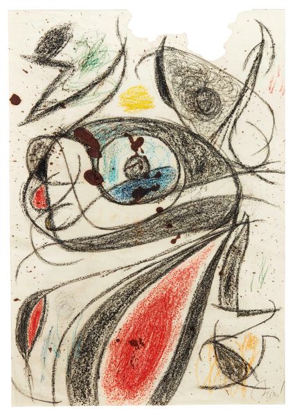
Joan Miro' I Ferrà©
(Barcelona, 1893 - Palma de mallorca, 1983)
Joan Miró i Ferrà
Joan Miró i Ferrà
(Barcelona 1893 - Palma de Mallorca 1983)
FEMME, [..]
2
Free Bid
Joan Miro' I Ferrà©
(Barcelona, 1893 - Palma de mallorca, 1983)
Joan Miró i Ferrà
Joan Miró i Ferrà
(Barcelona 1893 - Palma de Mallorca 1983)
FEMME, [..]
Estimate
€ 30.000 / 50.000
Sold
3
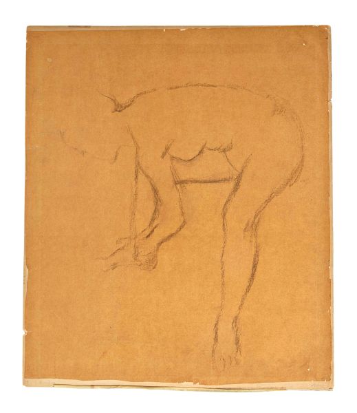
Edgar Degas
(Parigi, 1834 - 1917)
Edgar Degas
Edgar Degas
(Paris 1834 - 1917)
FEMME S’ESSUYANT LE PIED
1880 circa [..]
3
Free Bid
Edgar Degas
(Parigi, 1834 - 1917)
Edgar Degas
Edgar Degas
(Paris 1834 - 1917)
FEMME S’ESSUYANT LE PIED
1880 circa [..]
Estimate
€ 10.000 / 15.000
Sold
4
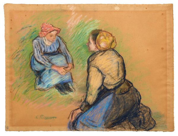
Camille Pissarro
(Charlotte amalie, 1830 - Paris, 1903)
Camille Pissarro
Camille Pissarro
(Charlotte Amalie 1830 - Paris 1903)
PAYSANNES ASSISES
1880 [..]
4
Free Bid
Camille Pissarro
(Charlotte amalie, 1830 - Paris, 1903)
Camille Pissarro
Camille Pissarro
(Charlotte Amalie 1830 - Paris 1903)
PAYSANNES ASSISES
1880 [..]
Estimate
€ 50.000 / 70.000
Sold

5
Federico Zandomeneghi
(Venezia, 1841 - Paris, 1917)
Federico Zandomeneghi
Federico Zandomeneghi
(Venezia 1841 - Paris 1917)
FEMME AU BOUQUET
1914
[..]
5
Free Bid
Federico Zandomeneghi
(Venezia, 1841 - Paris, 1917)
Federico Zandomeneghi
Federico Zandomeneghi
(Venezia 1841 - Paris 1917)
FEMME AU BOUQUET
1914
[..]
Estimate
€ 120.000 / 180.000
Sold
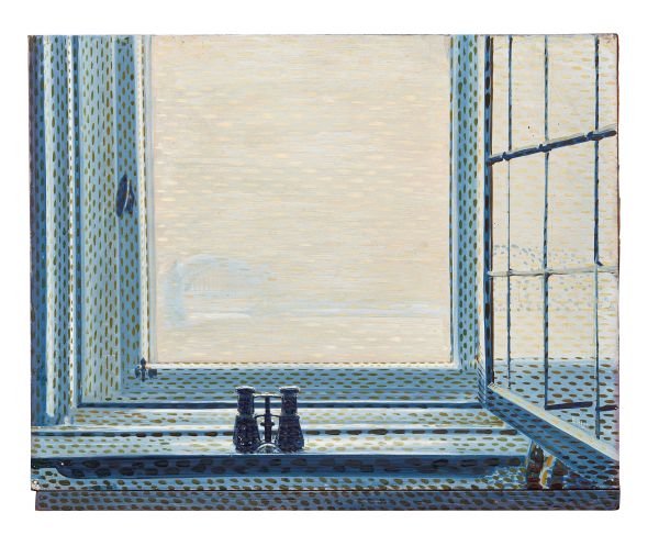
Giacomo Balla©
(Torino, 1871 - Roma, 1958)
Giacomo Balla
Giacomo Balla
(Torino 1871 - Roma 1958)
FINESTRA DI DÜSSELDORF
novembre [..]
6
Free Bid
Giacomo Balla©
(Torino, 1871 - Roma, 1958)
Giacomo Balla
Giacomo Balla
(Torino 1871 - Roma 1958)
FINESTRA DI DÜSSELDORF
novembre [..]
Estimate
€ 70.000 / 100.000
Sold

7
Paul Gauguin
(Paris, 1848 - Hiva oa, 1903)
Paul Gauguin
Paul Gauguin
(Paris 1848 - Hiva Oa 1903)
JACINTHES ET POMMES SUR UN JOURNAL
[..]
7
Free Bid
Paul Gauguin
(Paris, 1848 - Hiva oa, 1903)
Paul Gauguin
Paul Gauguin
(Paris 1848 - Hiva Oa 1903)
JACINTHES ET POMMES SUR UN JOURNAL
[..]
Estimate
€ 150.000 / 250.000
Sold
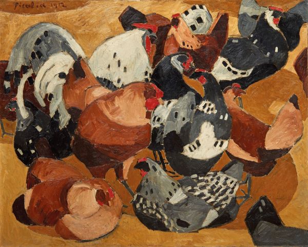
Francis Picabia©
(Paris, 1879 - 1953)
Francis Picabia
Francis Picabia
(Paris 1879 - 1953)
LE POULAILLER
1912
firmato e datato [..]
8
Free Bid
Francis Picabia©
(Paris, 1879 - 1953)
Francis Picabia
Francis Picabia
(Paris 1879 - 1953)
LE POULAILLER
1912
firmato e datato [..]
Estimate
€ 150.000 / 250.000
Sold
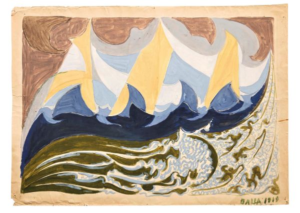
Giacomo Balla©
(Torino, 1871 - Roma, 1958)
Giacomo Balla
Giacomo Balla
(Torino 1871 - Roma 1958)
FUTURLIBECCIATA ( recto )
1919
[..]
9
Free Bid
Giacomo Balla©
(Torino, 1871 - Roma, 1958)
Giacomo Balla
Giacomo Balla
(Torino 1871 - Roma 1958)
FUTURLIBECCIATA ( recto )
1919
[..]
Estimate
€ 30.000 / 50.000
Sold
Giacomo Balla©
(Torino, 1871 - Roma, 1958)
Giacomo Balla
Giacomo Balla
(Torino 1871 - Roma 1958)
RITRATTO DI LAURA MARCUCCI CAMBELLOTTI [..]
10
Free Bid
Giacomo Balla©
(Torino, 1871 - Roma, 1958)
Giacomo Balla
Giacomo Balla
(Torino 1871 - Roma 1958)
RITRATTO DI LAURA MARCUCCI CAMBELLOTTI [..]
Estimate
€ 30.000 / 50.000
Sold
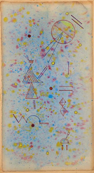
11
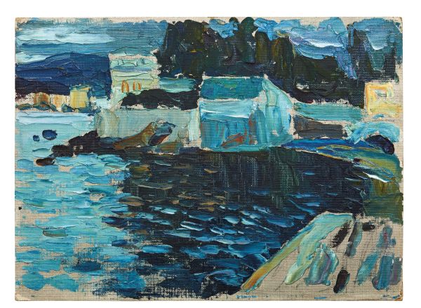
Vassily Kandinsky
(Mosca, 1866 - Neully-sur-seine, 1944)
Vassilly Kandinsky
Vassilly Kandinsky
(Mosca 1866 - Neully-sur-Seine 1944)
SESTRI-ABENDS
1905 [..]
11
Free Bid
Vassily Kandinsky
(Mosca, 1866 - Neully-sur-seine, 1944)
Vassilly Kandinsky
Vassilly Kandinsky
(Mosca 1866 - Neully-sur-Seine 1944)
SESTRI-ABENDS
1905 [..]
Estimate
€ 150.000 / 250.000
Sold
12
Vittorio Matteo Corcos
(Livorno, 1859 - Firenze, 1933)
Vittorio Matteo Corcos
Vittorio Matteo Corcos
(Livorno 1859 - Firenze 1933)
DONNA CON CANE
1885
[..]
12
Free Bid
Vittorio Matteo Corcos
(Livorno, 1859 - Firenze, 1933)
Vittorio Matteo Corcos
Vittorio Matteo Corcos
(Livorno 1859 - Firenze 1933)
DONNA CON CANE
1885
[..]
Estimate
€ 80.000 / 120.000
Sold
René Magritte©
(Lessines, 1898 - Bruxelles, 1967)
René Magritte
René Magritte
(Lessines 1898 - Bruxelles 1967)
LA TAPISSIERE DE PÉNÉLOPE [..]
13
Free Bid
René Magritte©
(Lessines, 1898 - Bruxelles, 1967)
René Magritte
René Magritte
(Lessines 1898 - Bruxelles 1967)
LA TAPISSIERE DE PÉNÉLOPE [..]
Estimate
€ 90.000 / 150.000
Sold
14
Gaetano Previati
(Ferrara, 1852 - Lavagna, 1920)
Gaetano Previati
Gaetano Previati
(Ferrara 1852 - Lavagna 1920)
PENSIERI
1885 circa
firmato [..]
14
Free Bid
Gaetano Previati
(Ferrara, 1852 - Lavagna, 1920)
Gaetano Previati
Gaetano Previati
(Ferrara 1852 - Lavagna 1920)
PENSIERI
1885 circa
firmato [..]
Estimate
€ 15.000 / 25.000
Sold
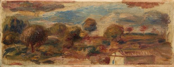
15
Pierre-Auguste Renoir
(Limoges, 1841 - Cagnes-sur-mer, 1919)
Pierre-Auguste Renoir
Pierre-Auguste Renoir
(Limoges 1841 - Cagnes-sur-Mer 1919)
PAYSAGE DU MIDI
[..]
15
Free Bid
Pierre-Auguste Renoir
(Limoges, 1841 - Cagnes-sur-mer, 1919)
Pierre-Auguste Renoir
Pierre-Auguste Renoir
(Limoges 1841 - Cagnes-sur-Mer 1919)
PAYSAGE DU MIDI
[..]
Estimate
€ 40.000 / 60.000
Sold
16
Vassily Kandinsky
(Mosca, 1866 - Neully-sur-seine, 1944)
Vassilly Kandinsky
Vassilly Kandinsky
(Mosca 1866 - Neully-sur-Seine 1944)
DÜNN UND FLECKIG SOUPLE [..]
16
Free Bid
Vassily Kandinsky
(Mosca, 1866 - Neully-sur-seine, 1944)
Vassilly Kandinsky
Vassilly Kandinsky
(Mosca 1866 - Neully-sur-Seine 1944)
DÜNN UND FLECKIG SOUPLE [..]
Estimate
€ 120.000 / 180.000
Sold
17
Vincent Van Gogh
(Zundert, 1853 - Auvers-sur-oise, 1890)
Vincent van Gogh
Vincent van Gogh
(Zundert 1853 - Auvers-sur-Oise 1890)
STILL LIFE WITH A BASKET [..]
17
Free Bid
Vincent Van Gogh
(Zundert, 1853 - Auvers-sur-oise, 1890)
Vincent van Gogh
Vincent van Gogh
(Zundert 1853 - Auvers-sur-Oise 1890)
STILL LIFE WITH A BASKET [..]
Estimate
€ 280.000 / 350.000
Sold
18
Giacomo Favretto
(Venezia, 1849 - 1887)
Giacomo Favretto
Giacomo Favretto
(Venezia 1849 - 1887)
VENDITRICE DI UCCELLI
1881 circa
[..]
18
Free Bid
Giacomo Favretto
(Venezia, 1849 - 1887)
Giacomo Favretto
Giacomo Favretto
(Venezia 1849 - 1887)
VENDITRICE DI UCCELLI
1881 circa
[..]
Estimate
€ 80.000 / 120.000
Sold
19
Henri De Toulouse-Lautrec
(Albi, 1864 - Saint-andré-du-bois, 1901)
Henri de Toulouse-Lautrec
Henri de Toulouse-Lautrec
(Albi 1864 - Saint-André-du-Bois 1901)
TÊTE [..]
19
Free Bid
Henri De Toulouse-Lautrec
(Albi, 1864 - Saint-andré-du-bois, 1901)
Henri de Toulouse-Lautrec
Henri de Toulouse-Lautrec
(Albi 1864 - Saint-André-du-Bois 1901)
TÊTE [..]
Estimate
€ 80.000 / 120.000
Sold
Henri Matisse©
(Le cateau-cambrésis, 1869 - Nice, 1954)
Henri Matisse
Henri Matisse
(Le Cateau-Cambrésis 1869 - Nice 1954)
PORT DE COLLIOURE
[..]
20
Free Bid
Henri Matisse©
(Le cateau-cambrésis, 1869 - Nice, 1954)
Henri Matisse
Henri Matisse
(Le Cateau-Cambrésis 1869 - Nice 1954)
PORT DE COLLIOURE
[..]
Estimate
€ 30.000 / 50.000
Sold

21
Claude Monet
(Paris, 1840 - Giverny, 1926)
Claude Monet
Claude Monet
(Paris 1840 - Giverny 1926)
FALAISE DU PETIT AILLY À VARENGEVILLE [..]
21
Free Bid
Claude Monet
(Paris, 1840 - Giverny, 1926)
Claude Monet
Claude Monet
(Paris 1840 - Giverny 1926)
FALAISE DU PETIT AILLY À VARENGEVILLE [..]
Estimate
€ 800.000 / 1.200.000
Sold
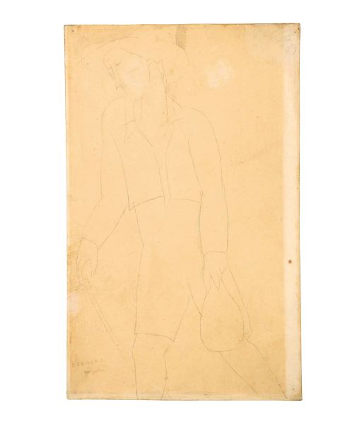
22
Amedeo Modigliani
(Livorno, 1884 - Paris, 1920)
Amedeo Modigliani
Amedeo Modigliani
(Livorno 1884 - Paris 1920)
BERGERIE
1915-1916
firmato [..]
22
Free Bid
Amedeo Modigliani
(Livorno, 1884 - Paris, 1920)
Amedeo Modigliani
Amedeo Modigliani
(Livorno 1884 - Paris 1920)
BERGERIE
1915-1916
firmato [..]
Estimate
€ 20.000 / 30.000
Sold
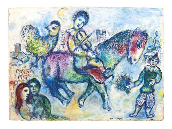
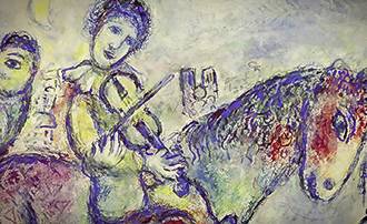
Marc Chagall©
(Vitebsk, 1887 - Saint-paul-de-vence, 1985)
Marc Chagall
Marc Chagall
(Vitebsk 1887 - Saint-Paul-de-Vence 1985)
MUSICIEN VOYAGEUR
1971 [..]
23
Free Bid
Marc Chagall©
(Vitebsk, 1887 - Saint-paul-de-vence, 1985)
Marc Chagall
Marc Chagall
(Vitebsk 1887 - Saint-Paul-de-Vence 1985)
MUSICIEN VOYAGEUR
1971 [..]
Estimate
€ 120.000 / 180.000
Sold
24
Umberto Boccioni
(Reggio calabria, 1882 - Verona, 1916)
Umberto Boccioni
Umberto Boccioni
(Reggio Calabria 1882 - Verona 1916)
DONNA CHE LEGGE
1909 [..]
24
Free Bid
Umberto Boccioni
(Reggio calabria, 1882 - Verona, 1916)
Umberto Boccioni
Umberto Boccioni
(Reggio Calabria 1882 - Verona 1916)
DONNA CHE LEGGE
1909 [..]
Estimate
€ 30.000 / 50.000
Sold
25
Federico Zandomeneghi
(Venezia, 1841 - Paris, 1917)
Federico Zandomeneghi
Federico Zandomeneghi
(Venezia 1841 - Paris 1917)
LA TOILETTE
1897 circa [..]
25
Free Bid
Federico Zandomeneghi
(Venezia, 1841 - Paris, 1917)
Federico Zandomeneghi
Federico Zandomeneghi
(Venezia 1841 - Paris 1917)
LA TOILETTE
1897 circa [..]
Estimate
€ 30.000 / 50.000
Sold
26
Paul Signac
(Paris, 1863 - 1935)
Paul Signac
Paul Signac
(Paris 1863 - 1935)
SAMOIS. ÉTUDE N. 11
1899
firmato [..]
26
Free Bid
Paul Signac
(Paris, 1863 - 1935)
Paul Signac
Paul Signac
(Paris 1863 - 1935)
SAMOIS. ÉTUDE N. 11
1899
firmato [..]
Estimate
€ 120.000 / 180.000
Sold

27
Alberto Pasini
(Busseto, 1826 - Cavoretto, 1899)
Alberto Pasini
Alberto Pasini
(Busseto 1826 - Cavoretto 1899)
SOUVENIR D’ORIENT
firmato [..]
27
Free Bid
Alberto Pasini
(Busseto, 1826 - Cavoretto, 1899)
Alberto Pasini
Alberto Pasini
(Busseto 1826 - Cavoretto 1899)
SOUVENIR D’ORIENT
firmato [..]
Estimate
€ 30.000 / 50.000
Sold
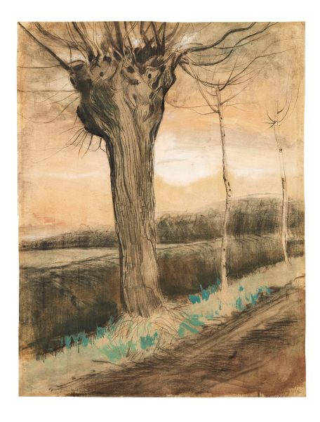
28
Vincent Van Gogh
(Zundert, 1853 - Auvers-sur-oise, 1890)
Vincent van Gogh
Vincent van Gogh
(Zundert 1853 - Auvers-sur-Oise 1890)
POLLARD WILLOW
ottobre [..]
28
Free Bid
Vincent Van Gogh
(Zundert, 1853 - Auvers-sur-oise, 1890)
Vincent van Gogh
Vincent van Gogh
(Zundert 1853 - Auvers-sur-Oise 1890)
POLLARD WILLOW
ottobre [..]
Estimate
€ 200.000 / 300.000
Sold
29
Umberto Boccioni
(Reggio calabria, 1882 - Verona, 1916)
Umberto Boccioni
Umberto Boccioni
(Reggio Calabria 1882 - Verona 1916)
IL FALCIATORE
oppure [..]
29
Free Bid
Umberto Boccioni
(Reggio calabria, 1882 - Verona, 1916)
Umberto Boccioni
Umberto Boccioni
(Reggio Calabria 1882 - Verona 1916)
IL FALCIATORE
oppure [..]
Estimate
€ 150.000 / 250.000
Sold
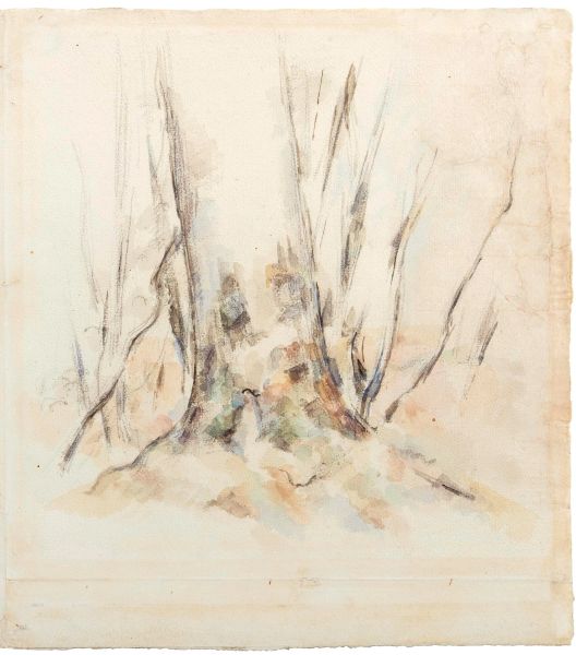
30
Paul Cézanne
(Aix-en-provence, 1839 - 1906)
Paul Cézanne
Paul Cézanne
(Aix-en-Provence 1839 - 1906)
LE HÊTRE
1883-1885 [..]
30
Free Bid
Paul Cézanne
(Aix-en-provence, 1839 - 1906)
Paul Cézanne
Paul Cézanne
(Aix-en-Provence 1839 - 1906)
LE HÊTRE
1883-1885 [..]
Estimate
€ 80.000 / 120.000
Sold