1
- 14
of 14 LOTS
1
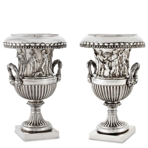
‘Trofeo’ workshop, Venice; second quarter, 18th century. Silversmith: probably Andrea Fulici, assayer: Zuanne Cottini
‘Trofeo’ workshop, Venice; second quarter, 18th century. Silversmith: probably Andrea Fulici, [..]
1
Free Bid
‘Trofeo’ workshop, Venice; second quarter, 18th century. Silversmith: probably Andrea Fulici, assayer: [..]
‘Trofeo’ workshop, Venice; second quarter, 18th century. Silversmith: probably Andrea Fulici, [..]
Estimate
€ 30.000 / 40.000
2
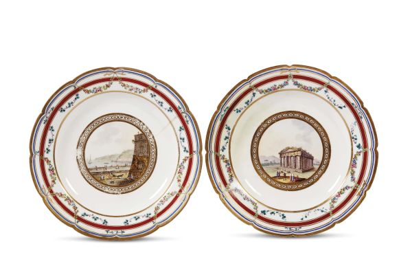
AN ASSORTMENT OF PLATES FROM THE ‘VEDUTE DEL REGNO’ (VIEWS OF THE KINGDOM) PRESENTATION SERVICE, OTHERWISE KNOWN AS THE ‘SERVIZIO DELL’OCA’. NAPLES, REAL FABBRICA FERDINANDEA, 1793-1795
AN ASSORTMENT OF PLATES FROM THE ‘VEDUTE DEL REGNO’ (VIEWS OF THE KINGDOM) PRESENTATION SERVICE, [..]
2
Free Bid
AN ASSORTMENT OF PLATES FROM THE ‘VEDUTE DEL REGNO’ (VIEWS OF THE KINGDOM) PRESENTATION SERVICE, OTHERWISE [..]
AN ASSORTMENT OF PLATES FROM THE ‘VEDUTE DEL REGNO’ (VIEWS OF THE KINGDOM) PRESENTATION SERVICE, [..]
Estimate
€ 10.000 / 15.000
Sold
3
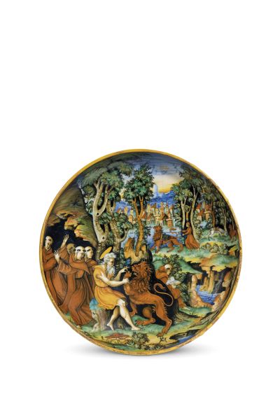
A DISH URBINO, WORKSHOP OF GUIDO DURANTINO, SIGNED WITH THE MONOGRAM AM, F.S., FORMERLY THE WORKSHOP OF FRANCESCO DE SILVANO (?), 1542
A DISH URBINO, WORKSHOP OF GUIDO DURANTINO, SIGNED WITH THE MONOGRAM AM, F.S. , FORMERLY THE WORKSHOP [..]
3
Free Bid
A DISH URBINO, WORKSHOP OF GUIDO DURANTINO, SIGNED WITH THE MONOGRAM AM, F.S., FORMERLY THE WORKSHOP [..]
A DISH URBINO, WORKSHOP OF GUIDO DURANTINO, SIGNED WITH THE MONOGRAM AM, F.S. , FORMERLY THE WORKSHOP [..]
Estimate
€ 40.000 / 60.000
Sold
4
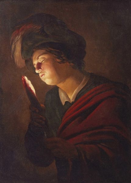
Gerrit van Honthorst, also known as Gherardo delle Notti
Gerrit van Honthorst, also known as Gherardo delle Notti (Utrecht 1590 – 1656) A BOY BLOWING ON [..]
4
Free Bid
Gerrit van Honthorst, also known as Gherardo delle Notti
Gerrit van Honthorst, also known as Gherardo delle Notti (Utrecht 1590 – 1656) A BOY BLOWING ON [..]
Estimate
€ 300.000 / 500.000
Sold
5
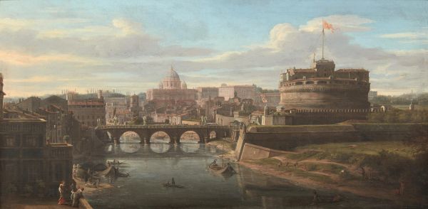
Gaspar van Wittel (Gaspare Vanvitelli)
Gaspar van Wittel (Gaspare Vanvitelli) (Amersfoort (Utrecht) 1652/53 – Rome 1736) A VIEW OF THE [..]
5
Free Bid
Gaspar van Wittel (Gaspare Vanvitelli)
Gaspar van Wittel (Gaspare Vanvitelli) (Amersfoort (Utrecht) 1652/53 – Rome 1736) A VIEW OF THE [..]
Estimate
€ 500.000 / 800.000
6
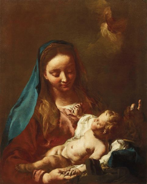
Giovanni Battista Piazzetta
Giovanni Battista Piazzetta (Venice 1682-1754) VIRGIN AND CHILD oil on canvas, cm 77x61
An export [..]
6
Free Bid
Giovanni Battista Piazzetta
Giovanni Battista Piazzetta (Venice 1682-1754) VIRGIN AND CHILD oil on canvas, cm 77x61
An export [..]
Estimate
€ 80.000 / 120.000
7
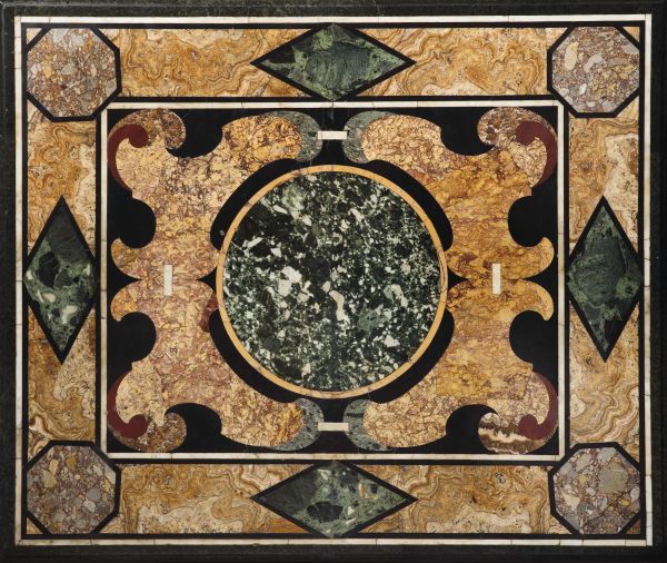
Florentine manufacture, early 17th century
Florentine manufacture, early 17th century A TABLETOP in polychrome stone commesso work, cm. 101 [..]
7
Free Bid
Florentine manufacture, early 17th century
Florentine manufacture, early 17th century A TABLETOP in polychrome stone commesso work, cm. 101 [..]
Estimate
€ 60.000 / 90.000
Sold
8
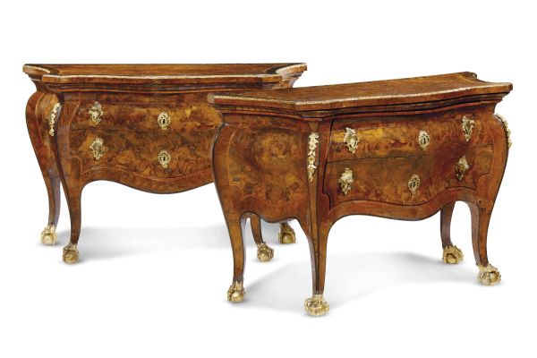
A PAIR OF MID-EIGHTEENTH CENTURY COMMODES, PAPAL STATE - ROME
A PAIR OF MID-EIGHTEENTH CENTURY COMMODES, PAPAL STATE - ROME poplar carcase, with elm and walnut burl [..]
8
Free Bid
A PAIR OF MID-EIGHTEENTH CENTURY COMMODES, PAPAL STATE - ROME
A PAIR OF MID-EIGHTEENTH CENTURY COMMODES, PAPAL STATE - ROME poplar carcase, with elm and walnut burl [..]
Estimate
€ 40.000 / 60.000
Sold
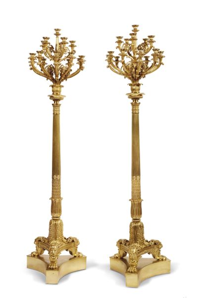
9
A PAIR OF MONUMENTAL TORCHÈRES, LONDON, 1830 CA.
A PAIR OF MONUMENTAL TORCHÈRES , LONDON, 1830 CA.
in gilded bronze. With a shaped triangular [..]
9
Free Bid
A PAIR OF MONUMENTAL TORCHÈRES, LONDON, 1830 CA.
A PAIR OF MONUMENTAL TORCHÈRES , LONDON, 1830 CA.
in gilded bronze. With a shaped triangular [..]
Estimate
€ 30.000 / 50.000
Sold
10
Osvaldo Borsani
Osvaldo Borsani
(Varedo 1911 – Milan 1985)
Lucio Fontana
(Rosario de Santa Fè 1899 [..]
10
Free Bid
Osvaldo Borsani
Osvaldo Borsani
(Varedo 1911 – Milan 1985)
Lucio Fontana
(Rosario de Santa Fè 1899 [..]
Estimate
€ 60.000 / 90.000
Sold
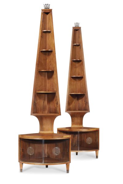
11
Gio Ponti
Gio Ponti
(Milan. 1891-1972)
A PAIR OF CORNER CABINETS FOR THE CONTINI BONACOSSI RESIDENCE, VILLA [..]
11
Free Bid
Gio Ponti
Gio Ponti
(Milan. 1891-1972)
A PAIR OF CORNER CABINETS FOR THE CONTINI BONACOSSI RESIDENCE, VILLA [..]
Estimate
€ 90.000 / 120.000
Sold
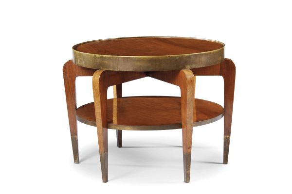
12
Gio Ponti
Gio Ponti
(Milan. 1891-1972)
A COFFEE TABLE FOR THE CONTINI BONACOSSI RESIDENCE, VILLA VITTORIA, FLORENCE, [..]
12
Free Bid
Gio Ponti
Gio Ponti
(Milan. 1891-1972)
A COFFEE TABLE FOR THE CONTINI BONACOSSI RESIDENCE, VILLA VITTORIA, FLORENCE, [..]
Estimate
€ 40.000 / 60.000
Sold
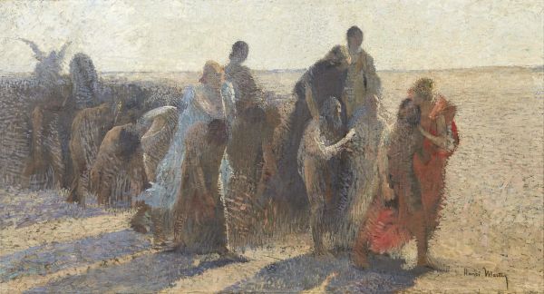
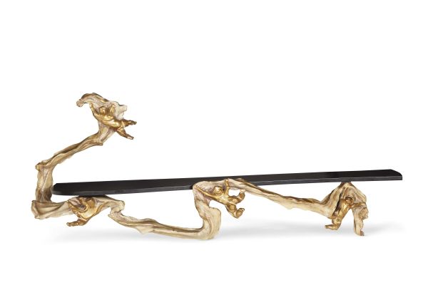
13
Henri-Jean-Guillaume Martin
Henri-Jean-Guillaume Martin
(Toulouse 1860 - La Bastide-du-Vert 1943)
A CHACUN SA CHIMÈRE [..]
13
Free Bid
Henri-Jean-Guillaume Martin
Henri-Jean-Guillaume Martin
(Toulouse 1860 - La Bastide-du-Vert 1943)
A CHACUN SA CHIMÈRE [..]
Estimate
€ 100.000 / 150.000
14
Free Bid
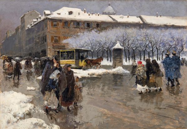
Mosè Bianchi
Mosè Bianchi
(Monza 1840 - 1904)
OLD MILAN
oil on cardboard, cm 53,5x77
signed [..]
Estimate
€ 50.000 / 70.000
Sold
1
- 14
of 14 LOTS