1
- 27
of 27 LOTS
1
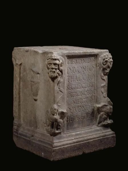
ALTAR
ALTAR ROMAN, 2 ND TO 3 RD CENTURY AD
Fine grain white marble, sculpted, polished, and finished off [..]
1
ALTAR
ALTAR ROMAN, 2 ND TO 3 RD CENTURY AD
Fine grain white marble, sculpted, polished, and finished off [..]
Estimate
€ 20.000 / 30.000
Sold
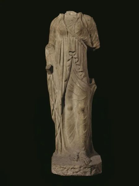
2
STATUE OF ARTEMIS
STATUE OF ARTEMIS
NEO-ATTIC CRAFTSMANSHIP, END OF THE 1 ST CENTURY B.C.
Medium grain white marble, sculpted [..]
2
STATUE OF ARTEMIS
STATUE OF ARTEMIS
NEO-ATTIC CRAFTSMANSHIP, END OF THE 1 ST CENTURY B.C.
Medium grain white marble, sculpted [..]
Estimate
€ 80.000 / 120.000
Sold
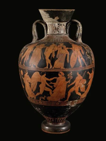
3
Amykos Painter
Amykos Painter
(active 430-410 BC)
LARGE RED-FIGURE PSEUDO-PANATHENAIC AMPHORA, LUCANIAN
Orange clay, [..]
3
Amykos Painter
Amykos Painter
(active 430-410 BC)
LARGE RED-FIGURE PSEUDO-PANATHENAIC AMPHORA, LUCANIAN
Orange clay, [..]
Estimate
€ 30.000 / 50.000
Sold
4
David Willaume I
David Willaume I (Metz 1658-London 1744)
EWER, LONDON, 1700 [..]
Estimate
€ 10.000 / 15.000
Sold
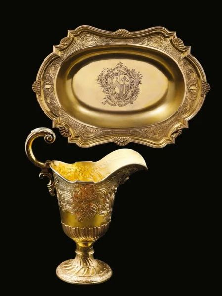
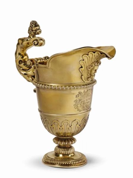
5
Ayme Videau
Ayme Videau
(active from 1723 to 1775)
EWER WITH BASIN, LONDON, 1755
in vermeil engraved and [..]
5
Ayme Videau
Ayme Videau
(active from 1723 to 1775)
EWER WITH BASIN, LONDON, 1755
in vermeil engraved and [..]
Estimate
€ 28.000 / 35.000
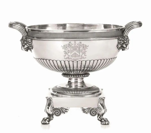
6
Paul Storr
Paul Storr
(Westminster 1771 - Tooting 1844)
CENTERPIECE, LONDON, 1805
silver, 27 [..]
Estimate
€ 12.000 / 18.000
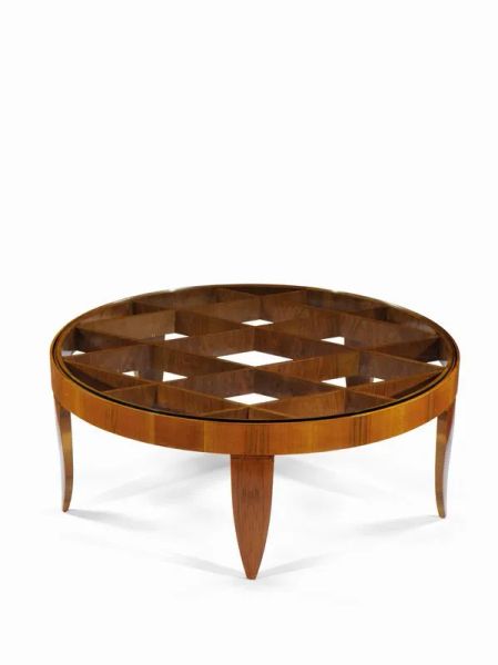
7
Gio Ponti
Gio Ponti
(Milan 1891-1972)
COFFEE TABLE, 1937
Chestnut briar root and crystal
Made by Giordano [..]
7
Gio Ponti
Gio Ponti
(Milan 1891-1972)
COFFEE TABLE, 1937
Chestnut briar root and crystal
Made by Giordano [..]
Estimate
€ 30.000 / 45.000
Sold
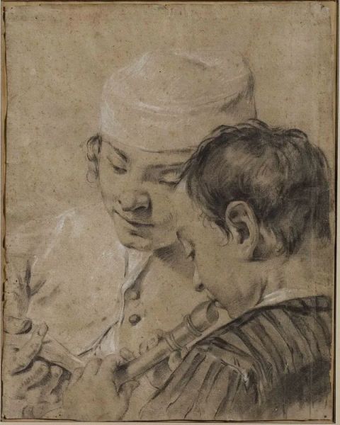
8
GIOVANNI BATTISTA PIAZZETTA
GIOVANNI BATTISTA PIAZZETTA
(Venezia 1683 – 1753)
Coppia di musicanti
Gessetto nero [..]
8
Free Bid
GIOVANNI BATTISTA PIAZZETTA
GIOVANNI BATTISTA PIAZZETTA
(Venezia 1683 – 1753)
Coppia di musicanti
Gessetto nero [..]
Estimate
€ 25.000 / 35.000
Sold
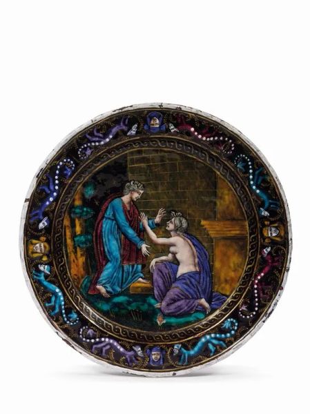
9
Limoges, mid-16th century
Limoges, mid-16 th century
JUNO REJECTING PSYCHE
Copper plate with enamel and gold, 21 cm diameter [..]
9
Limoges, mid-16th century
Limoges, mid-16 th century
JUNO REJECTING PSYCHE
Copper plate with enamel and gold, 21 cm diameter [..]
Estimate
€ 12.000 / 18.000
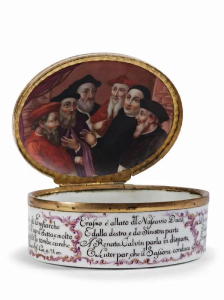
10
Ginori Manufactory, Doccia
Ginori Manufactory, Doccia
SNUFFBOX KNOWN AS “OF THE HERESIARCHS”, CA. 1760-1765
Polychrome [..]
10
Ginori Manufactory, Doccia
Ginori Manufactory, Doccia
SNUFFBOX KNOWN AS “OF THE HERESIARCHS”, CA. 1760-1765
Polychrome [..]
Estimate
€ 20.000 / 30.000
Sold
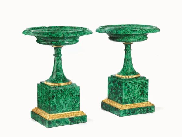
11
Imperial Lapidary Works
Imperial Lapidary Works
PAIR OF ORNAMENTAL VASES, RUSSIA, FIRST QUARTER OF THE 19TH CENTURY
Malachite [..]
11
Imperial Lapidary Works
Imperial Lapidary Works
PAIR OF ORNAMENTAL VASES, RUSSIA, FIRST QUARTER OF THE 19TH CENTURY
Malachite [..]
Estimate
€ 20.000 / 30.000
Sold
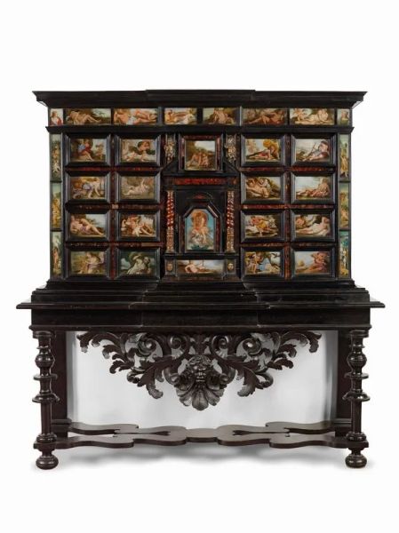
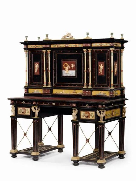
12
CABINET, NAPLES, SECOND HALF OF THE 17TH CENTURY
CABINET, NAPLES, SECOND HALF OF THE 17 TH CENTURY
Carved wood, veneered ebony and tortoiseshell [..]
12
CABINET, NAPLES, SECOND HALF OF THE 17TH CENTURY
CABINET, NAPLES, SECOND HALF OF THE 17 TH CENTURY
Carved wood, veneered ebony and tortoiseshell [..]
Estimate
€ 80.000 / 120.000
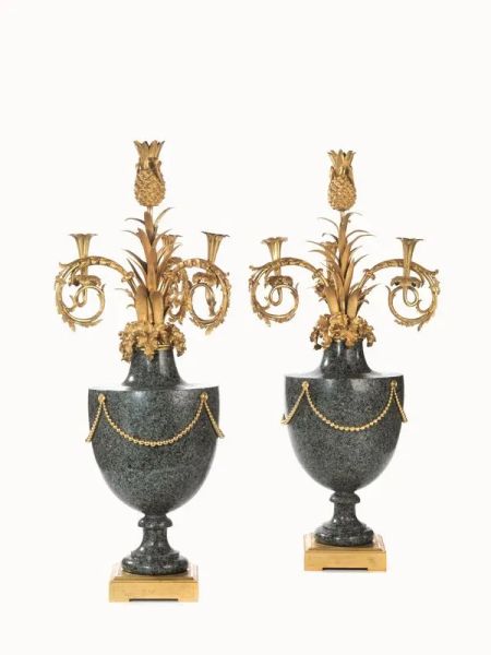
13
A LOUIS XVI PAIR OF GIRANDOLES, FRANCE, CIRCA 1775
A LOUIS XVI PAIR OF GIRANDOLES, FRANCE, CIRCA 1775
Green granite and gilded and chiselled bronze; vases [..]
13
A LOUIS XVI PAIR OF GIRANDOLES, FRANCE, CIRCA 1775
A LOUIS XVI PAIR OF GIRANDOLES, FRANCE, CIRCA 1775
Green granite and gilded and chiselled bronze; vases [..]
Estimate
€ 80.000 / 120.000
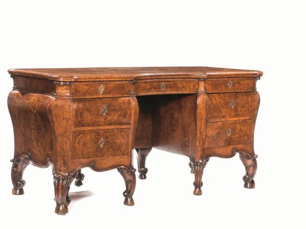
14
RARE CENTRE DESK, LOMBARDY, THIRD QUARTER OF THE 18TH CENTURY
RARE CENTRE DESK, LOMBARDY, THIRD QUARTER OF THE 18TH CENTURY Veneered chestnut and chestnut briar, rounded [..]
14
RARE CENTRE DESK, LOMBARDY, THIRD QUARTER OF THE 18TH CENTURY
RARE CENTRE DESK, LOMBARDY, THIRD QUARTER OF THE 18TH CENTURY Veneered chestnut and chestnut briar, rounded [..]
Estimate
€ 60.000 / 90.000
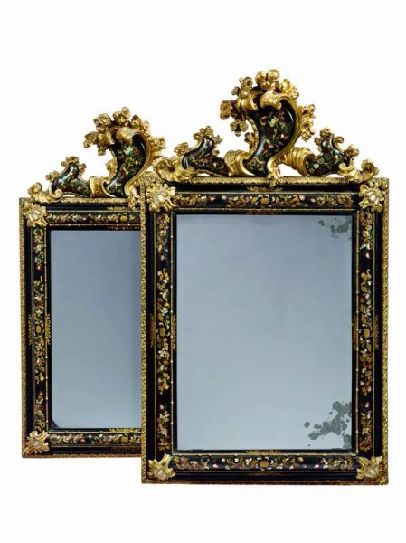
15
PAIR OF MIRRORS, VENICE, SECOND QUARTER OF THE 18TH CENTURYPAIR OF MIRRORS, VENICE, SECOND QUARTER OF [..]
PAIR OF MIRRORS, VENICE, SECOND QUARTER OF THE 18TH CENTURY
in ebonized, lacquered and gilded wood [..]
Estimate
€ 70.000 / 100.000
16
Regia Scuola di incisione sul corallo
Regia Scuola di incisione sul corallo
EBONY, LAVASTONE, GILT BRONZE, MOTHER-OF-PEARL, TORTOISESHELL [..]
16
Regia Scuola di incisione sul corallo
Regia Scuola di incisione sul corallo
EBONY, LAVASTONE, GILT BRONZE, MOTHER-OF-PEARL, TORTOISESHELL [..]
Estimate
€ 40.000 / 60.000
Sold
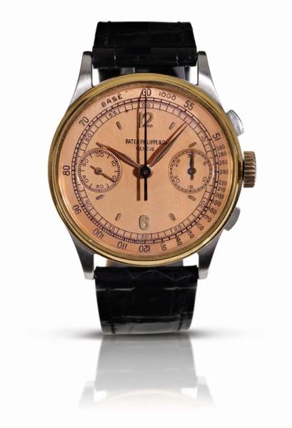
17
AN EXTREMELY FINE AND RARE STAINLESS STEEL AND 18K PINK GOLD CHRONOGRAPH WRISTWATCH, PATEK PHILIPPE , REF. 130, MOVEMENT NO. 867’038, CASE NO. 630’157, MANUFACTURED IN 1946, WITH PATEK PHILIPPE EXTRACT FROM THE ARCHIVE
RARO OROLOGIO DA POLSO CON CRONOGRAFO PATEK PHILIPPE, REF. 130, MOV. N. 867’038, CASSA N. 630’157, [..]
17
AN EXTREMELY FINE AND RARE STAINLESS STEEL AND 18K PINK GOLD CHRONOGRAPH WRISTWATCH, PATEK PHILIPPE [..]
RARO OROLOGIO DA POLSO CON CRONOGRAFO PATEK PHILIPPE, REF. 130, MOV. N. 867’038, CASSA N. 630’157, [..]
Estimate
€ 130.000 / 180.000
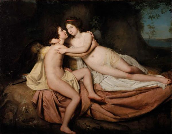
18
Domenico Pellegrini
Domenico Pellegrini
(Galliera Veneta 1759 - Rome 1840)
PORTRAIT OF FILIPPO AND COSTANZA DE MARINIS [..]
18
Domenico Pellegrini
Domenico Pellegrini
(Galliera Veneta 1759 - Rome 1840)
PORTRAIT OF FILIPPO AND COSTANZA DE MARINIS [..]
Estimate
€ 60.000 / 80.000
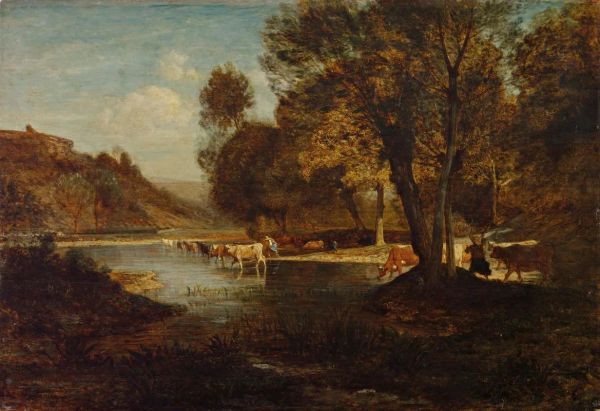
19
Antonio Fontanesi
Antonio Fontanesi
(Reggio nell'Emilia 1818 - Turin 1882)
IL GUADO
oil on panel, 78,5x115 cm [..]
19
Antonio Fontanesi
Antonio Fontanesi
(Reggio nell'Emilia 1818 - Turin 1882)
IL GUADO
oil on panel, 78,5x115 cm [..]
Estimate
€ 130.000 / 160.000
Sold
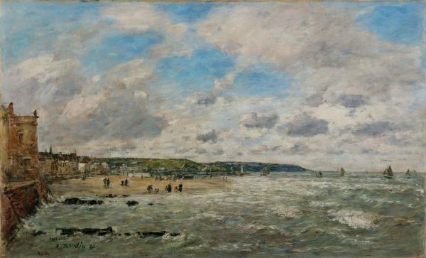
20
Eugene Boudin
Eugène Boudin
(Honfleur 1824 - Deauville 1898)
TROUVILLE, LE RIVAGE
oil on canvas, 55,5x92,5 [..]
20
Free Bid
Eugene Boudin
Eugène Boudin
(Honfleur 1824 - Deauville 1898)
TROUVILLE, LE RIVAGE
oil on canvas, 55,5x92,5 [..]
Estimate
€ 100.000 / 150.000
Sold
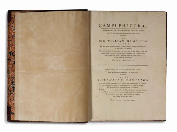
21
Sir William Hamilton
Sir William Hamilton
(Henley-on-Thames 1730 - London 1803)
CAMPI PHLEGRAEI. OBSERVATIONS ON THE [..]
21
Sir William Hamilton
Sir William Hamilton
(Henley-on-Thames 1730 - London 1803)
CAMPI PHLEGRAEI. OBSERVATIONS ON THE [..]
Estimate
€ 50.000 / 70.000
Sold
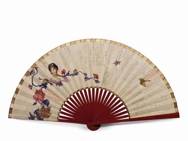
22
GRANDE VENTAGLIO DECORATO DA DUE ACQUARELLI DI GIACOMO FAVRETTO (1849 – 1887) E IMPREZIOSITO DA OLTRE 60 IMPORTANTI AUTOGRAFI E DEDICHE, DI CUI 14 AD OPERA DI CELEBRI MAESTRI DI MUSICA, LETTERATI E ATTORI, 1883 – 1993
LARGE FAN DECORATED WITH TWO WATERCOLORS BY GIACOMO FAVRETTO (1849 - 1887) AND ENHANCED BY OVER 60 IMPORTANT [..]
22
GRANDE VENTAGLIO DECORATO DA DUE ACQUARELLI DI GIACOMO FAVRETTO (1849 – 1887) E IMPREZIOSITO DA OLTRE [..]
LARGE FAN DECORATED WITH TWO WATERCOLORS BY GIACOMO FAVRETTO (1849 - 1887) AND ENHANCED BY OVER 60 IMPORTANT [..]
Estimate
€ 20.000 / 30.000
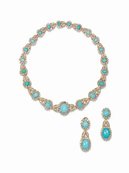
23
DEMI-PARURE, VAN CLEEF AND ARPELS, FINE ANNI '60, IN ORO GIALLO, TURCHESI E DIAMANTI
DEMI-PARURE, VAN CLEEF AND ARPELS, FINE ANNI '60, IN ORO GIALLO, TURCHESI E DIAMANTI
Composta di [..]
23
DEMI-PARURE, VAN CLEEF AND ARPELS, FINE ANNI '60, IN ORO GIALLO, TURCHESI E DIAMANTI
DEMI-PARURE, VAN CLEEF AND ARPELS, FINE ANNI '60, IN ORO GIALLO, TURCHESI E DIAMANTI
Composta di [..]
Estimate
€ 60.000 / 80.000
Sold
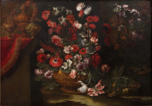
24
Andrea Scacciati
Andrea Scacciati
(Firenze 1642-1710)
VASO DI FIORI ALL'APERTO, SU UNA PIETRA; SULLO SFONDO, [..]
24
Andrea Scacciati
Andrea Scacciati
(Firenze 1642-1710)
VASO DI FIORI ALL'APERTO, SU UNA PIETRA; SULLO SFONDO, [..]
Estimate
€ 40.000 / 60.000
25
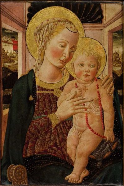
Maestro della lunetta di via Romana,
Maestro della lunetta di via Romana,
alias Bernardo di Stefano Rosselli
(Firenze 1450-1526) [..]
25
Free Bid
Maestro della lunetta di via Romana,
Maestro della lunetta di via Romana,
alias Bernardo di Stefano Rosselli
(Firenze 1450-1526) [..]
Estimate
€ 60.000 / 80.000
Sold
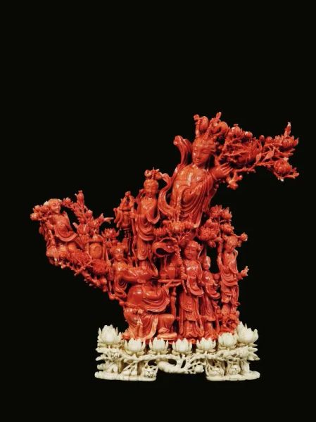
26
CARVING, CHINA, LATE QING DYNASTY, XIX CENTURY
CARVING, CHINA, LATE QING DYNASTY, XIX CENTURY Red coral, 24,5 cm high, 1965 g. weight Standing on a [..]
26
CARVING, CHINA, LATE QING DYNASTY, XIX CENTURY
CARVING, CHINA, LATE QING DYNASTY, XIX CENTURY Red coral, 24,5 cm high, 1965 g. weight Standing on a [..]
Estimate
€ 15.000 / 20.000
Sold
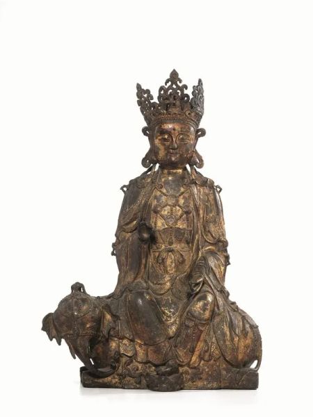
27
A GILT-LACQUERED BRONZE STATUETTE, CHINA, MING DYNASTY, 17TH CENTURY
A GILT-LACQUERED BRONZE STATUETTE, CHINA, MING DYNASTY, 17TH CENTURY 81,5 cm high
representing Bodhisattva [..]
27
A GILT-LACQUERED BRONZE STATUETTE, CHINA, MING DYNASTY, 17TH CENTURY
A GILT-LACQUERED BRONZE STATUETTE, CHINA, MING DYNASTY, 17TH CENTURY 81,5 cm high
representing Bodhisattva [..]
Estimate
€ 60.000 / 80.000
Sold
1
- 27
of 27 LOTS